
Pret A Voir — Brand refinement and ecommerce UX/UI for a luxury eyewear retailer
Brand refinement · Visual identity · Ecommerce UX/UI · Website design
Luxury eyewear and fashion · London, UK
The context
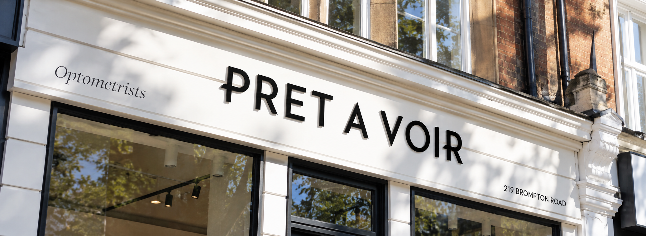
Pret A Voir is an established luxury eyewear retailer, selling designer optical frames and sunglasses online alongside its boutique in Knightsbridge.
When I came into the project, the business was already rebuilding its ecommerce website on Shopify. Development was underway, but there hadn't been enough strategic UX or design direction before the build started.
Individual pages and components were being developed, but there wasn't yet a clear system connecting the brand, customer experience and wider commercial requirements.
My role was to provide that missing layer.
The challenge
The quality of the digital experience didn't match the quality of the product being sold.
Pret A Voir sells eyewear from some of the world's leading fashion houses, often involving a considered purchase and prescription lenses. The website needed to create the confidence and sense of service that comes with that, without making the shopping experience slower or more complicated.
There was another balance to get right too.
The designer brands naturally bring a lot of equity, but Pret A Voir needed a stronger presence of its own. Customers needed to understand not just what they could buy, but why they should buy it from Pret A Voir.
At the same time, designer partners needed meaningful space for campaigns and launches, while the commercial team needed flexibility to merchandise products and services.
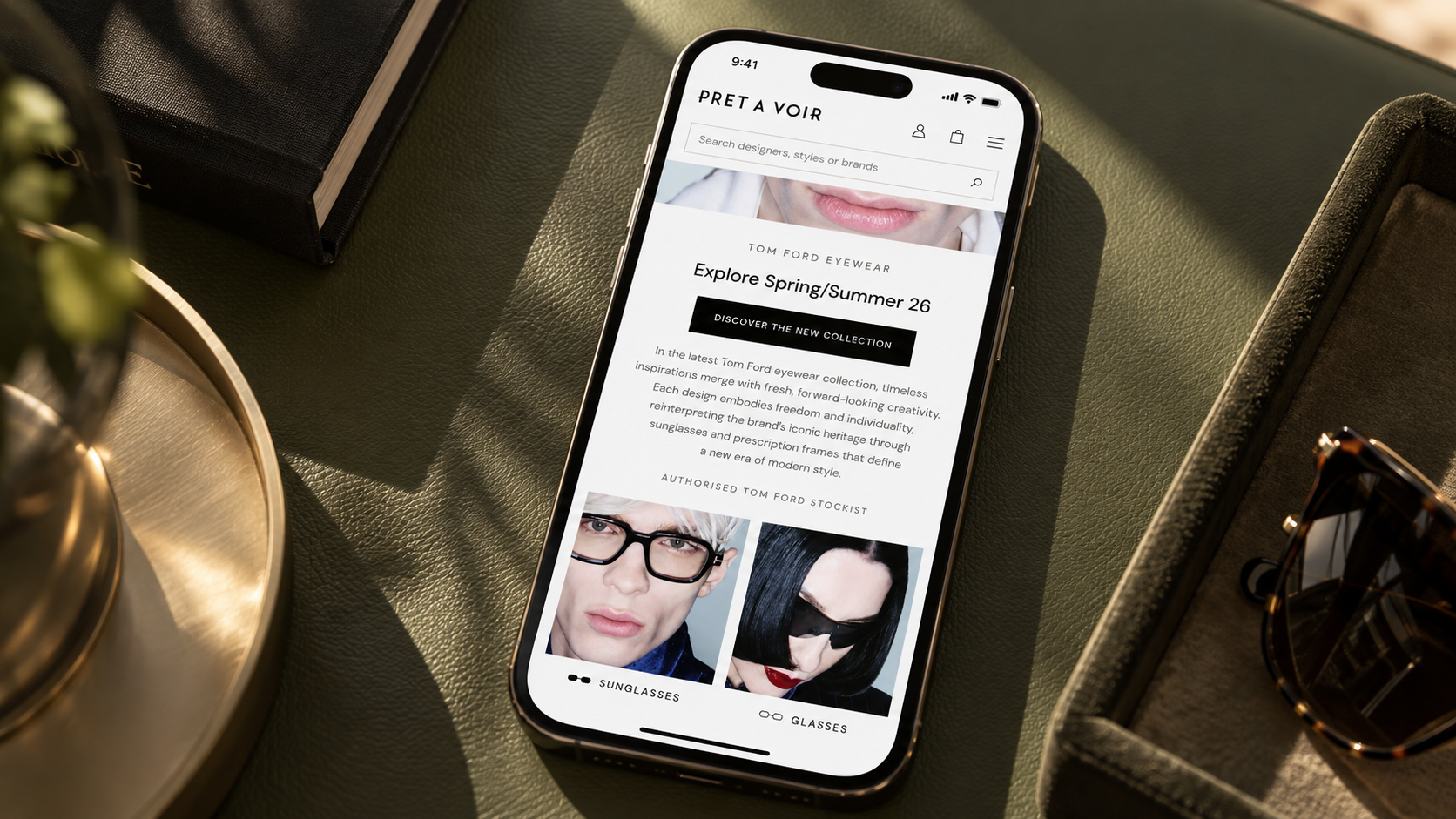
And with around 70% of traffic coming from mobile, often directly into product pages from Google, the experience couldn't be designed around the homepage and desktop first.

The approach
Rather than treating it as a collection of individual pages, I approached the website as one connected ecommerce system.
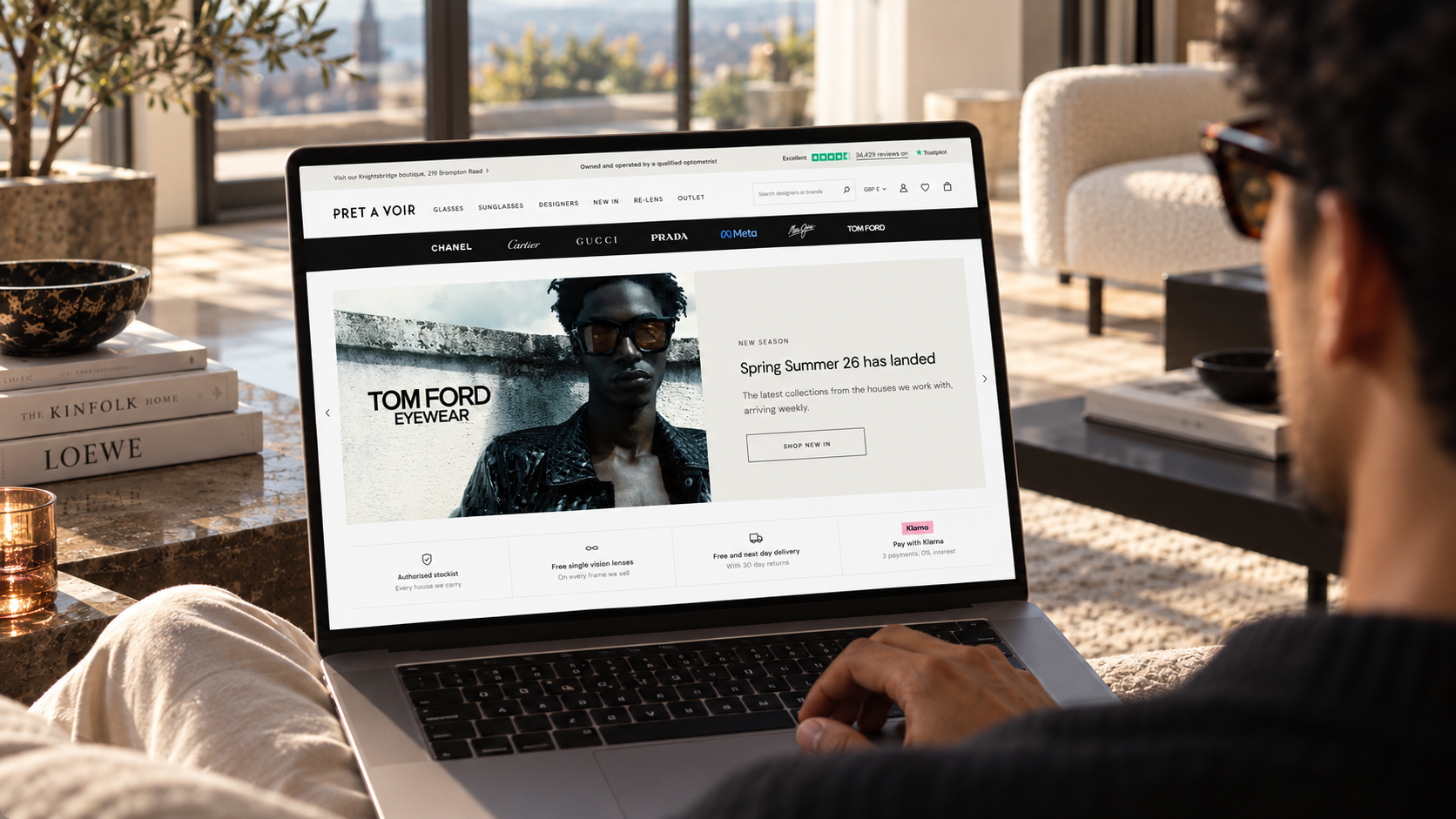
I focused on the four templates doing most of the work: the homepage, collection page, product page and Designer Brand Hub.
Each had a different job.
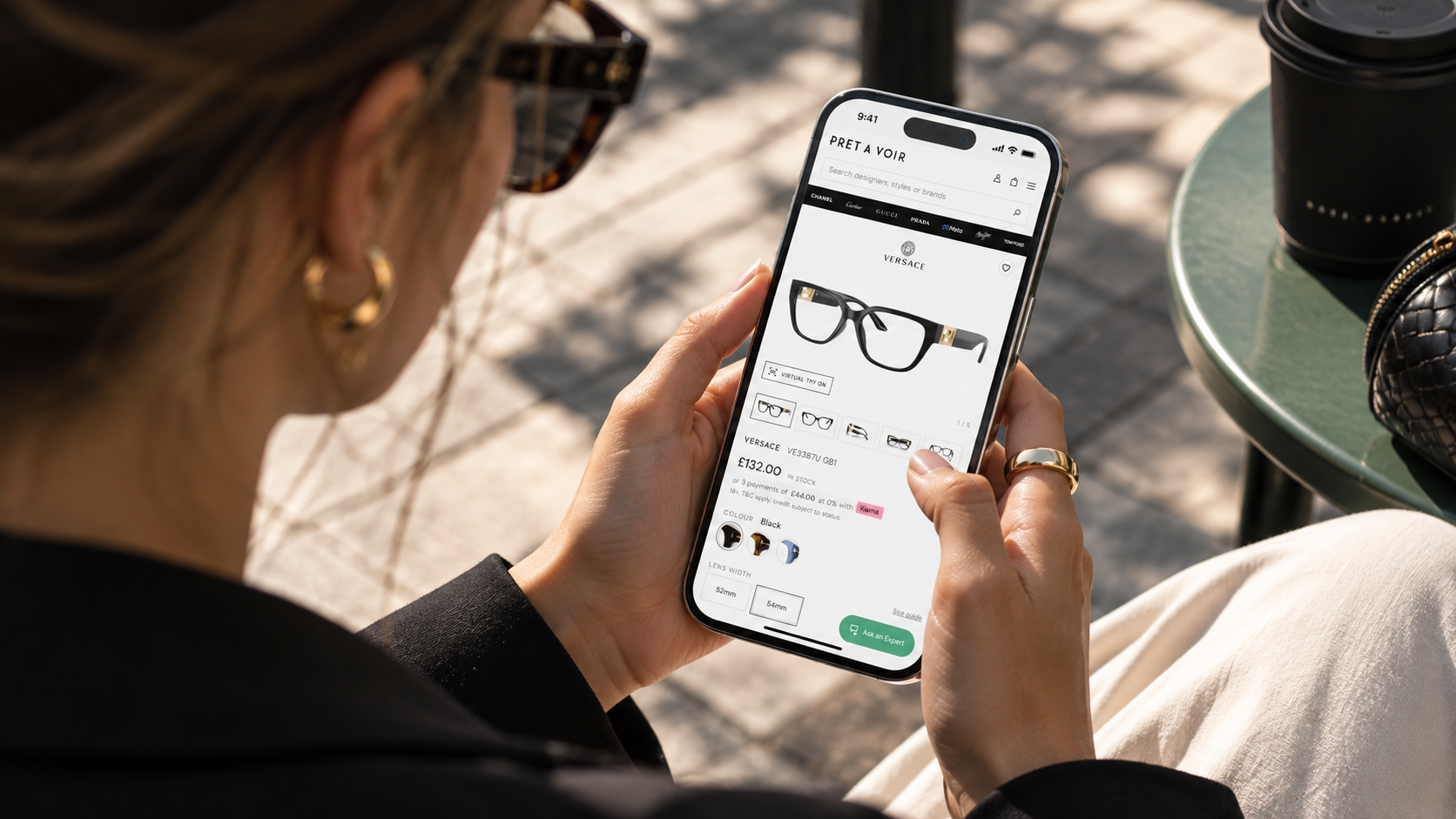
The homepage needed to establish Pret A Voir before handing over to the designer brands. Collection pages needed to get people into relevant products quickly. Product pages had to make a considered purchase, including prescription, feel simple and reassuring. The Designer Brand Hub needed to give fashion houses a richer environment without becoming a dead end for customers.
The aim wasn't to make Pret A Voir look more luxurious for the sake of it. It was to create a clearer relationship between the retailer, the products it sells and the service behind them.
The work
I started with a review of the existing site and Shopify build, then designed the core ecommerce experience mobile first through responsive, interactive prototypes.
As the UX developed, it became clear that the brand itself needed tightening too.
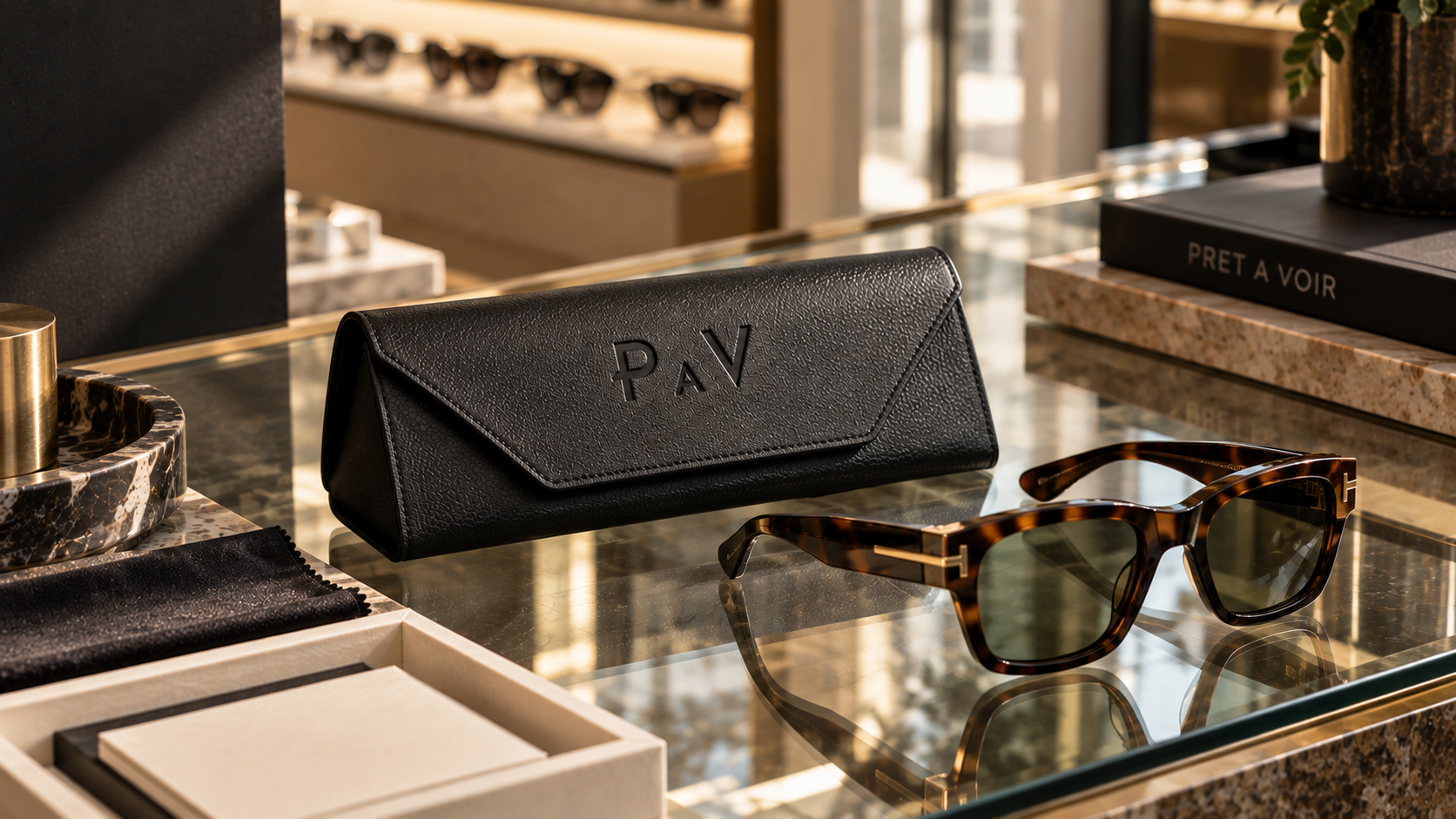
Rather than rebranding Pret A Voir, I refined what was already there. I developed a more flexible logo family, redrew the PAV monogram, introduced a new typography system and supporting colour palette, and brought everything together into a concise set of visual guidelines.
From there, I designed the homepage, collection page, product page and Designer Brand Hub, alongside the shared components that connect them, including navigation, product cards, campaign modules, trust messaging and calls to action.
Prescription was brought more clearly into the shopping journey, Pret A Voir's Knightsbridge boutique and optician expertise were given greater prominence, and new campaign formats created premium space for designer partners without overwhelming the customer experience.
I worked alongside Pret A Voir's existing development team throughout, finishing with approved responsive prototypes and a dedicated UX/UI style guide they could use to build the site consistently in Shopify.
The impact
The project gave Pret A Voir a much clearer system for how the brand should look, behave and sell online.
The four core templates now have distinct roles within the customer journey, while still feeling like part of the same retailer. Pret A Voir has a stronger presence alongside the fashion houses it represents, prescription is more naturally integrated, and the commercial team has more considered ways to promote products, services and brand partners.
Just as importantly, the development team now has a defined design system rather than having to interpret individual decisions as they build.
The new website is currently being implemented, so it's too early to attach conversion or revenue figures to the work. What the project has already done is remove the ambiguity between brand, ecommerce and development, and give Pret A Voir one clear system to build from.
Tell me about your project
If your website is being built before the brand and customer experience have been properly thought through, that's usually worth fixing before development gets too far. Tell me where you are and I'll come back to you within a working day.