
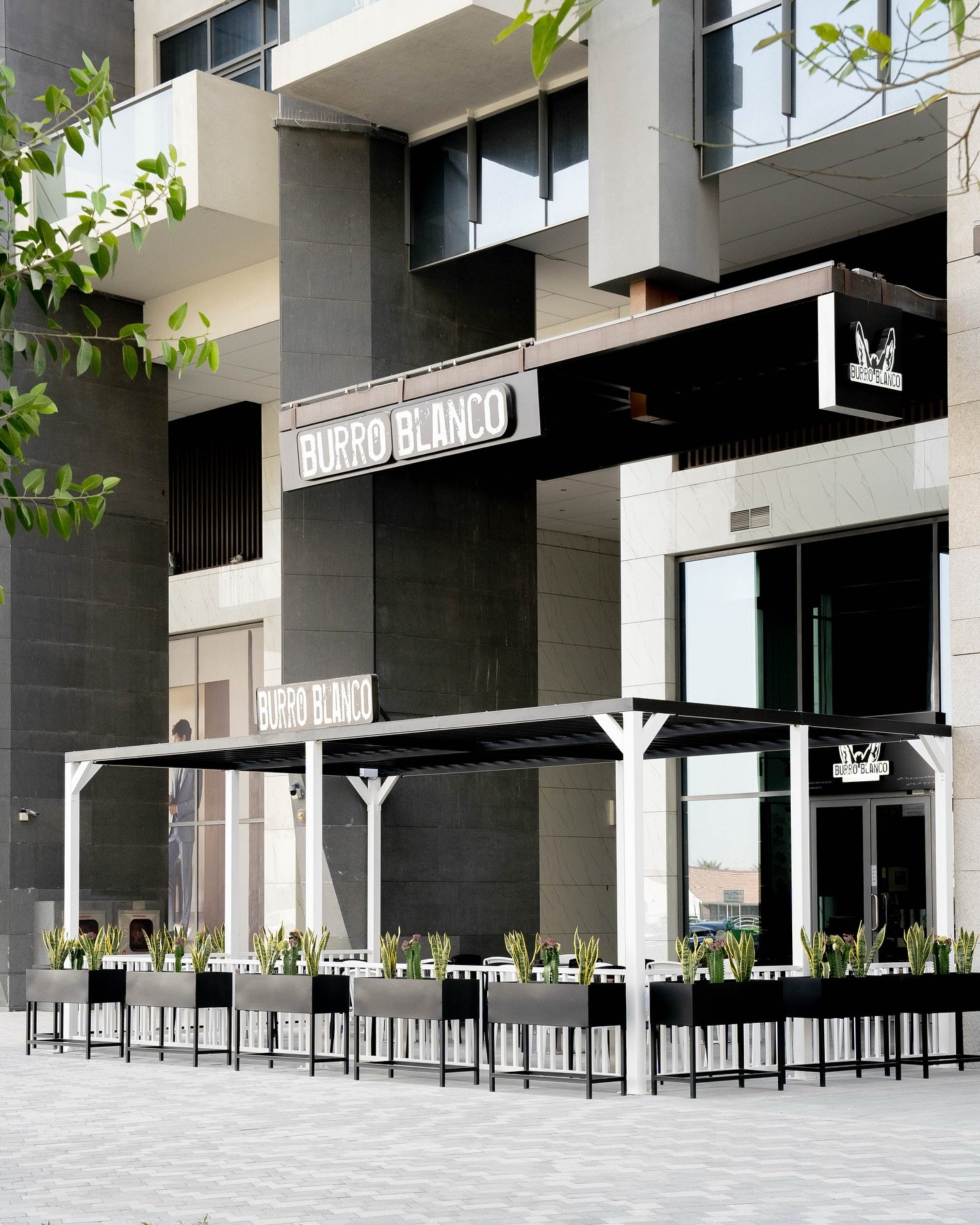
Burro Blanco — Brand repositioning and visual identity for a fast-growing QSR brand in the UAE
Brand strategy · Positioning · Visual identity · Brand messaging · Website UX · Brand rollout
Restaurants and QSR · Dubai and Abu Dhabi
The context
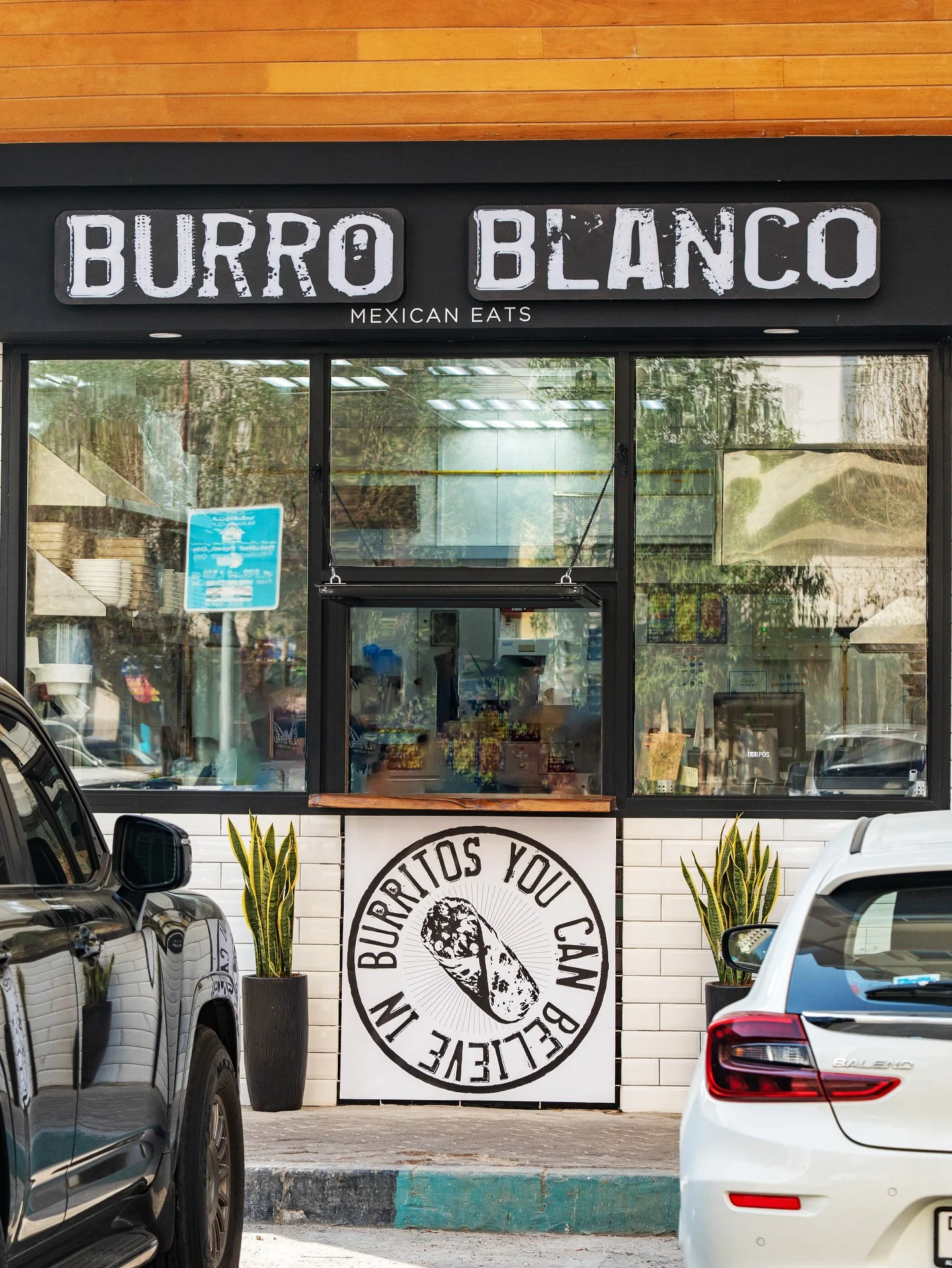
Burro Blanco started in 2018 from a small window in the backstreets of Khalidiya, Abu Dhabi. No seating, a few painted barrels outside for tables, and a queue.
By the time I came in, founder Saied El Hakim had grown the business across Abu Dhabi and Dubai, picked up a Time Out award and built a genuinely loyal following. He was now preparing to franchise across the Gulf and beginning conversations with investors.
Charlie Mander at Presman & Colard was advising on the franchise programme and brought me in to help get the brand ready for its next stage of growth.
The challenge
There were two main challenges, and one of them wasn't obvious at the start.
The first was familiar. Much of what made Burro Blanco work lived in Saied's head. He was still heavily involved in the recipes, the food and staff training, which was a big part of why the business had been successful.
But that becomes difficult when you start franchising. A partner opening in Riyadh or Kuwait needs to understand what makes the brand different, what can adapt locally and what should never change.
The second challenge was the identity.
Burro Blanco had a recognisable mark built around two cut-out donkey ears, but very few people actually saw them as donkey ears. I initially thought it was a bat. Other people saw a rabbit. And because Burro Blanco only means something if you speak Spanish, there wasn't an obvious connection between the name and the symbol.
In Abu Dhabi, years of word of mouth and familiarity had filled that gap. In a completely new market where nobody knows the brand, you don't have that advantage.

The approach
The obvious answer would have been to make everything more literal. Make the donkey clearer, explain what Burro Blanco means and remove any ambiguity.
But something Saied told me in our first workshop changed the direction.
The name came from an old folklore story about a man who travelled from farm to farm on a white donkey, feeding workers with rolled tortillas filled with meat, rice and salsa. Essentially burritos before anyone called them burritos.
It was the reason Saied had chosen the name in the first place, but hardly anybody knew the story.
Rather than removing that character from the brand, I felt we should bring more of it to life.
That meant making the donkey much more prominent and giving people a reason to ask about it. Saied understandably took some convincing. Putting a donkey's face front and centre on a growing food brand is a fairly bold decision.
But importantly, it wasn't a gimmick. There was a genuine story behind it that connected directly back to the name, the product and the origins of the business.

The work
I started with brand discovery and positioning workshops with Saied, followed by a full positioning document covering the mission, vision, values, value proposition, brand promise, tone of voice and franchise proposition.
One of the most important conversations was around what homegrown meant.
It was already central to Burro Blanco, but taken literally it becomes difficult the moment you franchise outside the UAE. We reframed homegrown as an approach rather than a location.
It meant sourcing locally where possible, working with local producers and becoming part of the community you're actually operating in. A franchise partner in Kuwait could therefore behave like a homegrown business in exactly the same way as the original site in Abu Dhabi.
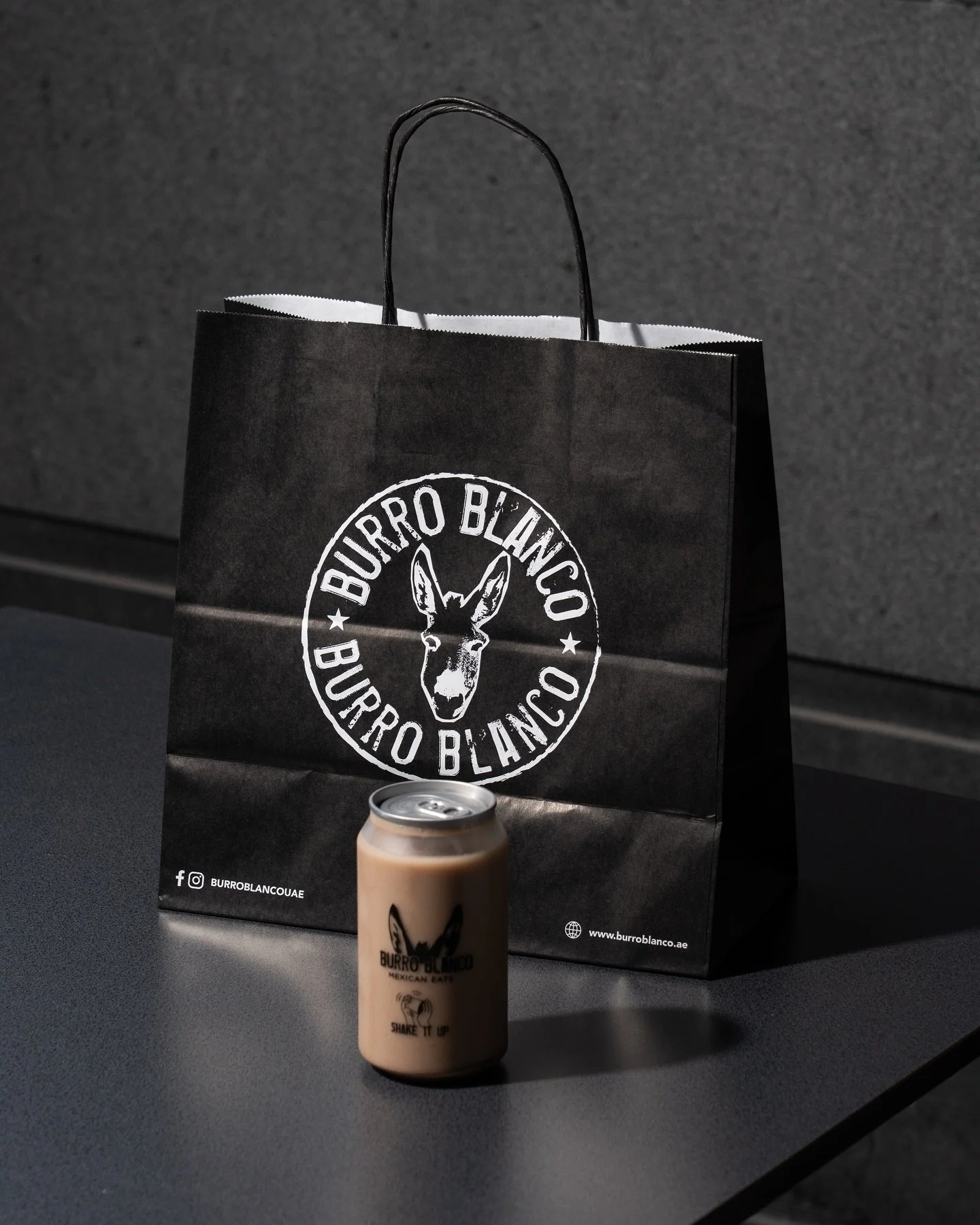
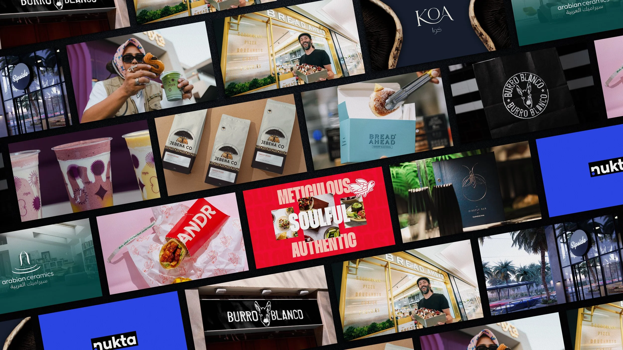
For the identity, I created new logo lockups built around a full donkey head, including a version that completed the original ears rather than simply replacing them.
I also developed the strapline “Burritos You Can Believe In”, connecting the wider brand promise back to the folklore behind the name, alongside a new tone of voice and messaging that gave Burro Blanco more personality beyond the menu.
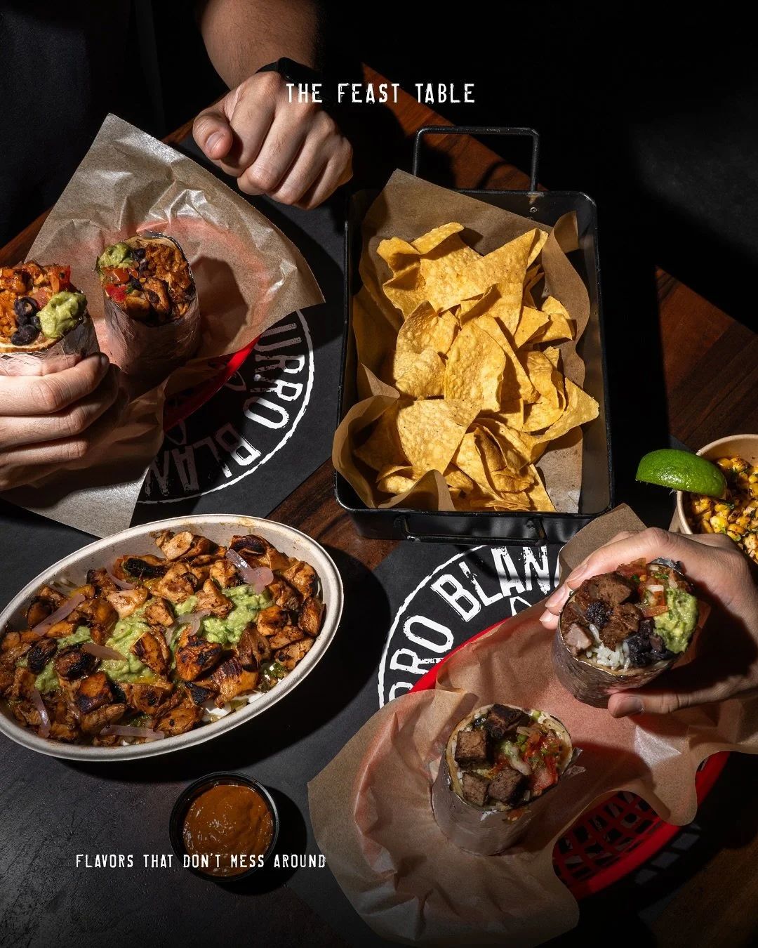
From there, the identity and messaging rolled out across menus, takeaway packaging, signage, the in-store environment and merchandise. I also designed the UX for the new website, bringing the same thinking into the digital experience.

The impact
Burro Blanco now trades from seven sites across Dubai and Abu Dhabi, including locations at NYU Abu Dhabi and Mohammed Bin Zayed University. Franchise conversations across the Gulf are ongoing.
For me, one of the clearest signs that the work landed is that the language and positioning are still being used across the brand today.
The website still talks about Burro Blanco's roots as a humble hole-in-the-wall, its no-frills approach and Mexican food done properly. “Burritos You Can Believe In” continues across merchandise, signage and packaging.
Most importantly, the brand now has a clearer story and a defined set of principles that can travel with it as the business grows.
Tell me about your project
If you're preparing to franchise and most of what makes the brand work still only exists in conversation, that's usually the first thing to fix. Tell me where you are and I'll come back to you within a working day.