

Myra — Brand naming and visual identity for a luxury patisserie in Saudi Arabia
Brand naming · Brand positioning · Visual identity · Brand rollout
Patisserie and hospitality · Jeddah, Saudi Arabia

The context
Amro Bagedo came to me with a concept rather than an existing business.
He wanted to create a French patisserie for Jeddah, built around proper pastry but designed around the way people actually live in the city, with a drive-through, late opening and click and collect.
He’d spent a decade working in investment management and had taken a lot of inspiration from London’s food scene. He’d also brought in Jonas Plangger, formerly of The Dorchester, to lead the kitchen.
I’d already worked with Amro across several of his businesses, so there was a good level of trust from the start and we could get into the bigger questions quite quickly.

The challenge
French patisserie is naturally associated with a very particular culture and style. The challenge was bringing that into Saudi Arabia without creating something that felt imported.
That mattered commercially. There was clearly an appetite for international quality, but we wanted to create something people in Jeddah would genuinely adopt as their own rather than simply visit because it was new.
So the brand needed to feel internationally aspirational while still making sense locally.
Going too heavily into traditional French cues risked turning it into a novelty. Going too far the other way would lose some of the quality and aspiration that made the concept interesting in the first place.
We needed to find a space between the two.

The approach
Rather than choosing between French and Saudi influences, I wanted to build the brand around a feeling that could work across both.
What we kept coming back to was the sense of wonder you get from really good patisserie. The detail, craft and presentation are all part of the experience. It should feel special before you’ve even tasted it.
That gave us a much more interesting place to build the brand from, without having to lean too heavily into either culture.
The name came from the same thinking.
Myra carries different meanings across Latin, Greek and Sanskrit, including ideas around the extraordinary, abundance and being beloved. It was short, memorable and worked comfortably in both Arabic and English without feeling like it belonged exclusively to either culture.
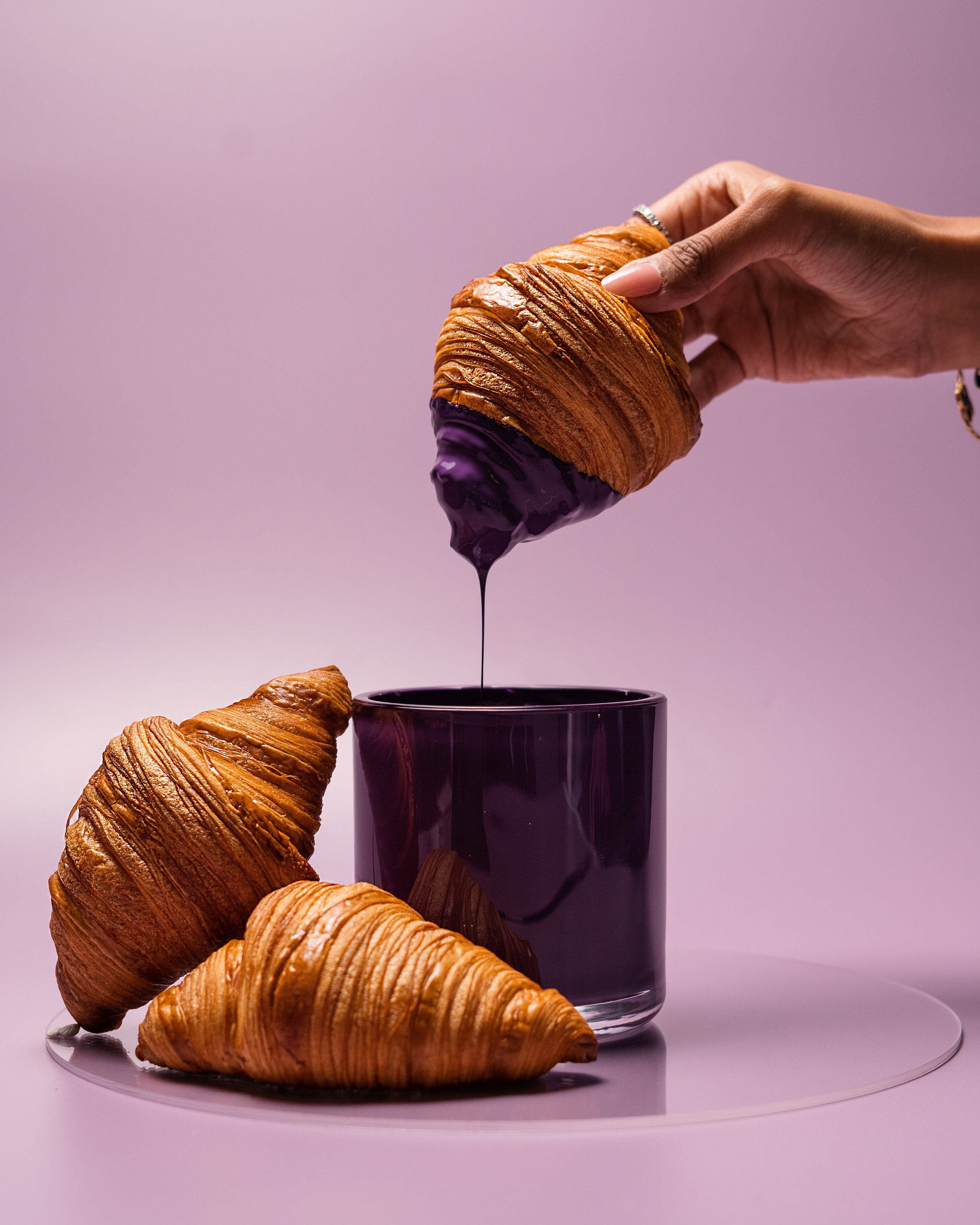
The visual identity then built on that sense of wonder, using stars, sparkle, deep colour and gold to create something rich and distinctive without relying on traditional French patisserie cues.

The work
I led the naming process from initial exploration through to the shortlist, meaning and early checks.
From there, I worked with Amro on the positioning and brand story, defining where Myra would sit in the market, who it was for and what we wanted it to become known for.
I then created the visual identity and wider creative direction, including the logo, typography and colour palette that could work across very different formats.
That was important because Myra wasn’t being designed for one traditional café. The identity needed to work across the main patisserie, a drive-through, a hospital grab-and-go format and packaging that needed to feel every bit as considered as the product inside it.
The brand was then rolled out across signage, packaging, menus, merchandise and the in-store environment.
I also created a corporate profile bringing together the brand story, positioning and commercial ambition, designed specifically for conversations with potential investors and partners rather than customers.

The impact
Myra opened on Hira Street in December 2023 and now operates from two locations in Jeddah, including a grab-and-go site at Erfan & Bagedo Hospital.
The drive-through, which stays open until midnight, was the first of its kind for a patisserie in the city and has become an important part of how the concept is recognised.
Two years on, the original identity and brand system are still in place, and Myra continues to receive coverage across Arab News, Caterer Middle East and the wider regional food press.
Most importantly, what started as an idea for bringing French-quality patisserie to Jeddah became a brand that feels like it belongs there.

Tell me about your project
If you're bringing an international concept into a market where it doesn't obviously belong, the brand has to do more work than usual. Tell me where you are and I'll come back to you within a working day.