
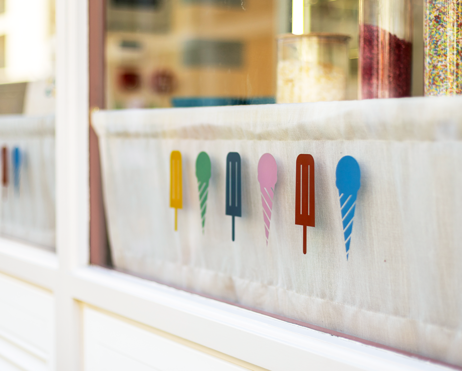
Sticks & Cones — Brand creation and visual identity for a new ice cream shop in Marylebone
Brand strategy · Positioning · Brand naming · Visual identity · Brand rollout · Website design
Ice cream and hospitality · Marylebone, London
The context
Petra had spent a decade working in sustainable food supply chains, so she already knew a lot about sourcing, provenance and what good ingredients looked like.
She lives locally in Marylebone with her family and kept running into the same problem. When her children asked for an ice cream, the only real option nearby was a pre-packaged lolly from the corner shop.
So she decided to create the place she wished already existed.
She had a clear idea of the quality she wanted and strong principles around the product and sourcing. What she didn’t have was a brand, or any previous experience of building one.
That was where I came in.
The challenge
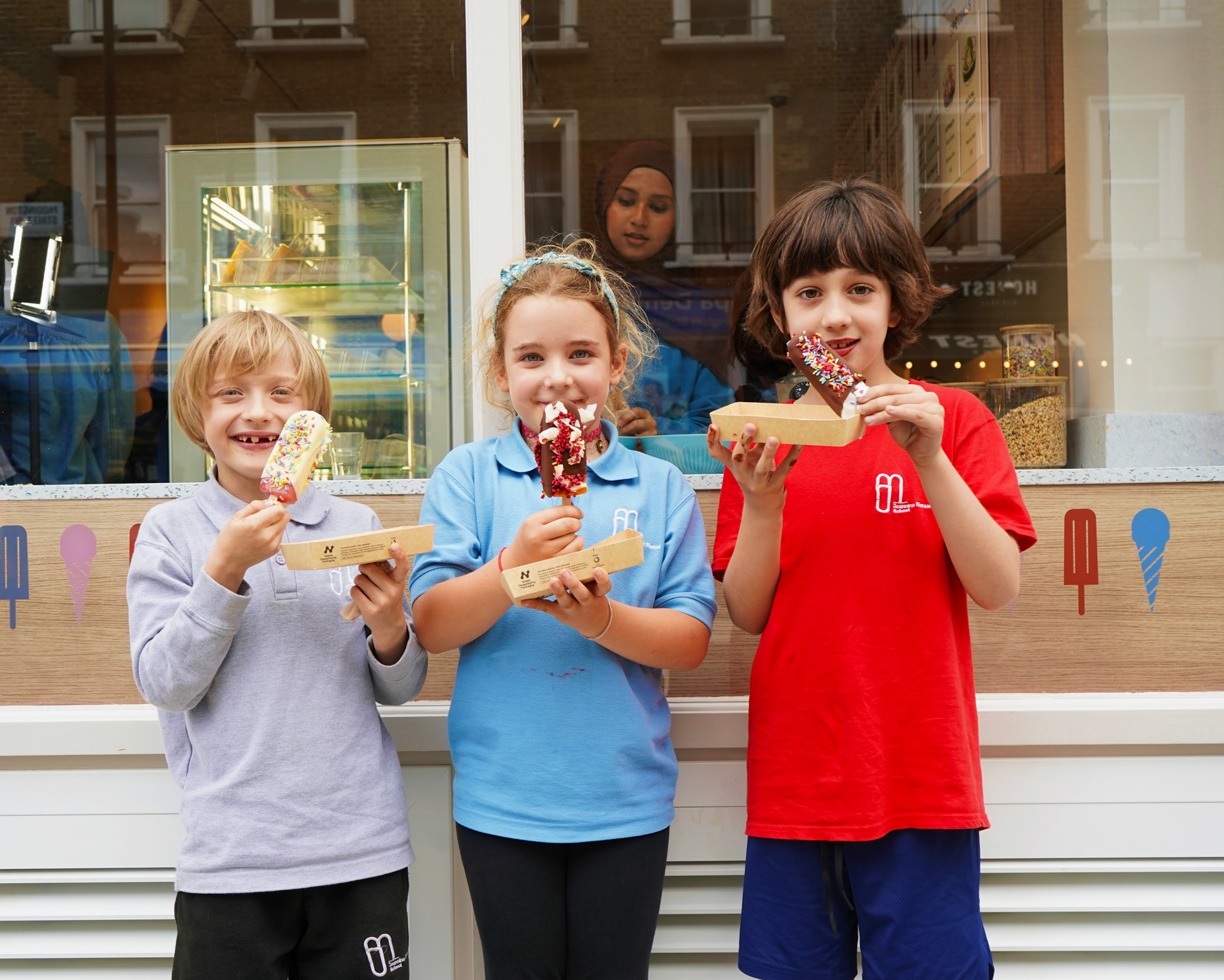
Marylebone has no shortage of good food. What it didn’t have was anywhere that quite worked for families.
The dedicated gelateria was Lebanese in style. The boutique pastry shops were excellent but largely built for adults. The cafés tended to be too quiet or formal for an afternoon with young children.
The opportunity was to create something that felt premium and family-friendly at the same time.
That balance is harder than it sounds. Go too bright and playful and it quickly becomes a children’s brand. Go too refined and families start to feel like they need to keep the children quiet.
And ultimately, it’s the parents deciding where everyone goes.
The approach
My recommendation was simple: build for the adult, welcome the child.
Create somewhere with enough restraint that a parent would genuinely want to spend time, while making children feel completely at home. The family-friendly elements needed to be built into the experience from the beginning rather than added afterwards.
The name came from the same thinking.
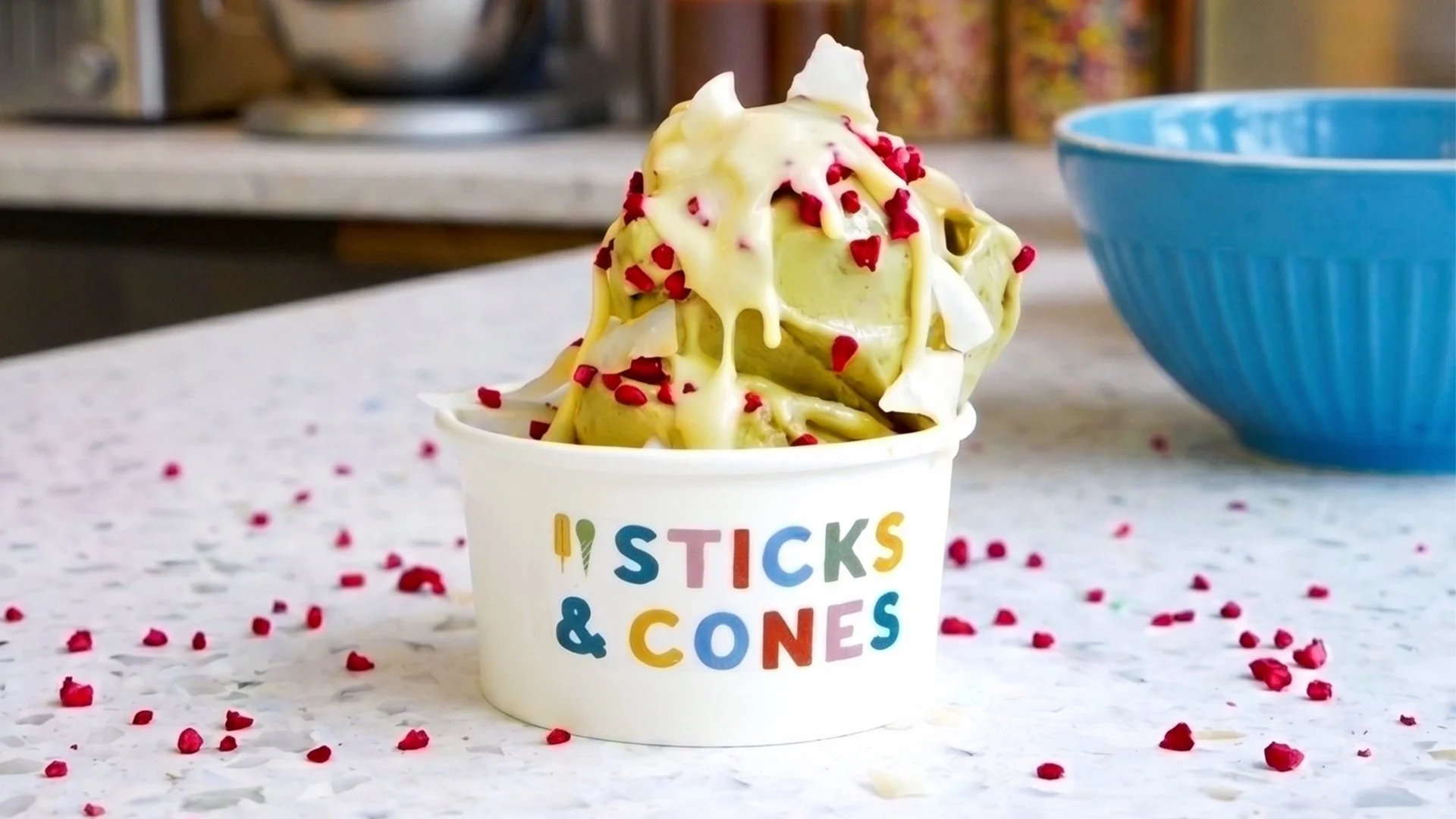
Sticks & Cones plays on the familiarity of “sticks and stones”, while naturally referencing the two things the business is built around. It felt warm and playful without becoming childish, which was exactly the balance we were looking for.
The work
I started with the brand strategy and positioning, looking at the local market, the audience and where there was a genuine opportunity to do something different.
From there we developed the name, exploring three different creative routes, with trademark and domain checks on the strongest options before Sticks & Cones was selected.
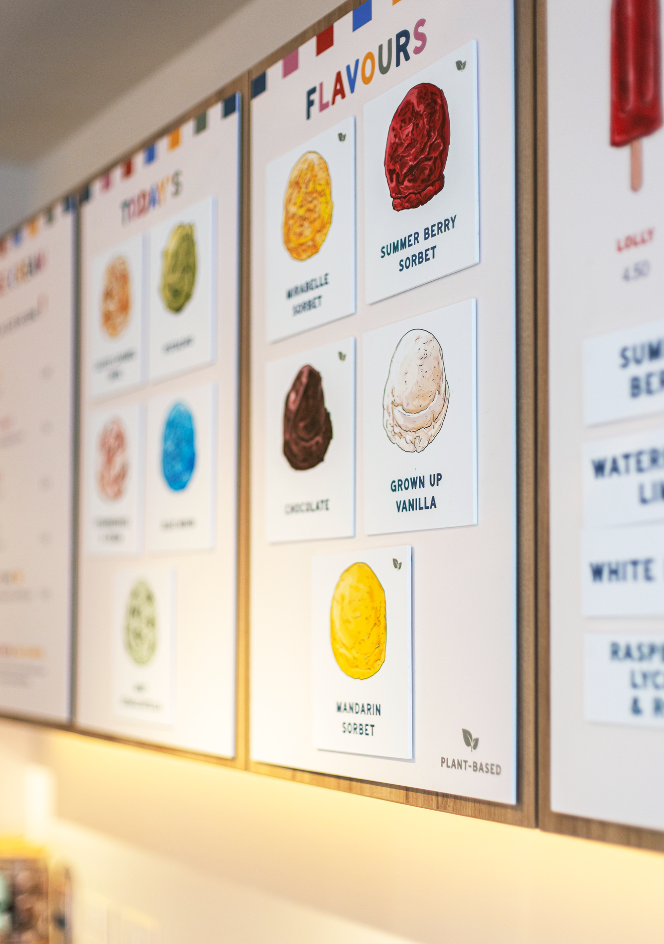
The visual identity was built around the same balance as the positioning. A warm buttercream base gave the brand a more considered feel, with primary colours used carefully to bring in personality and energy without becoming too loud.
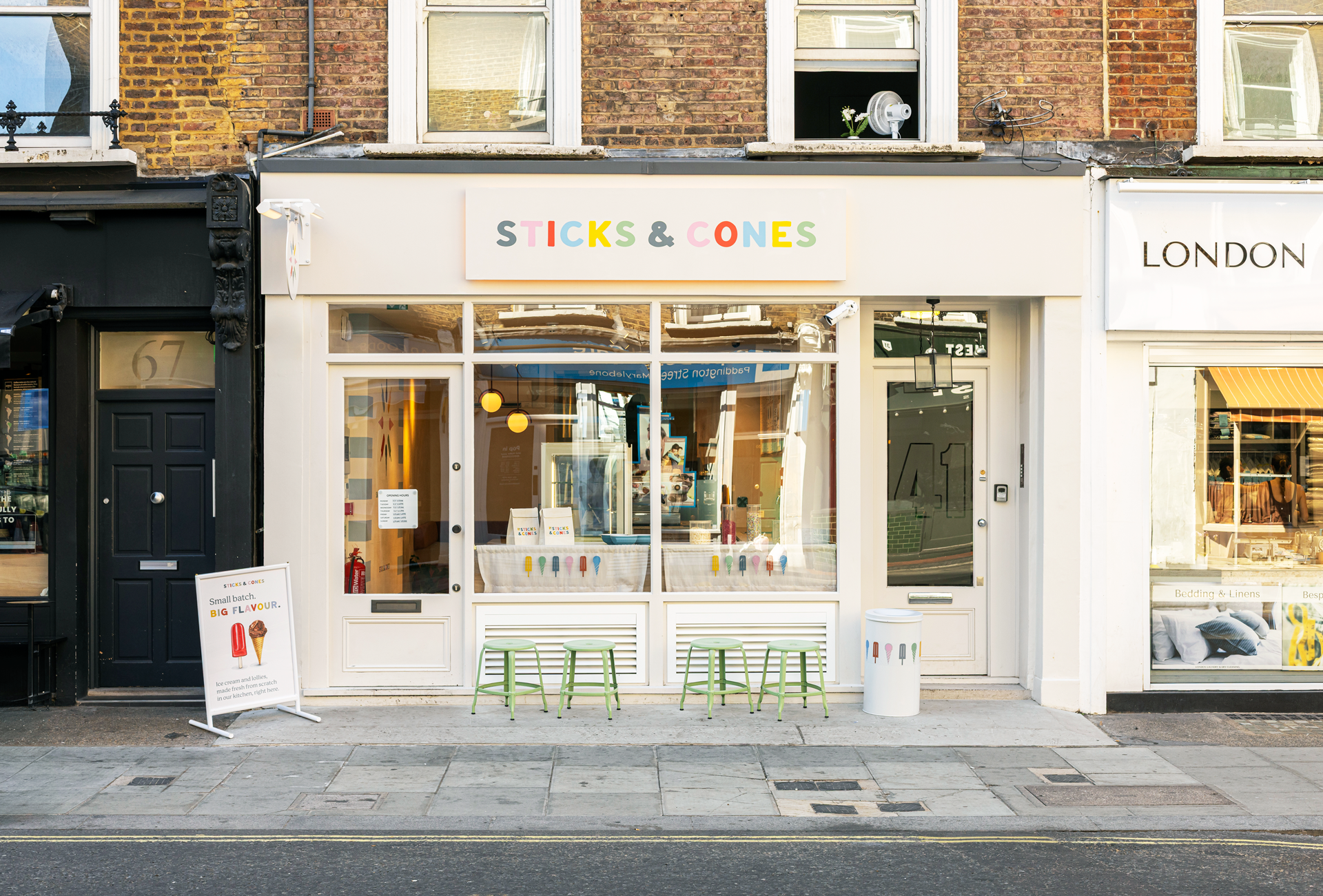
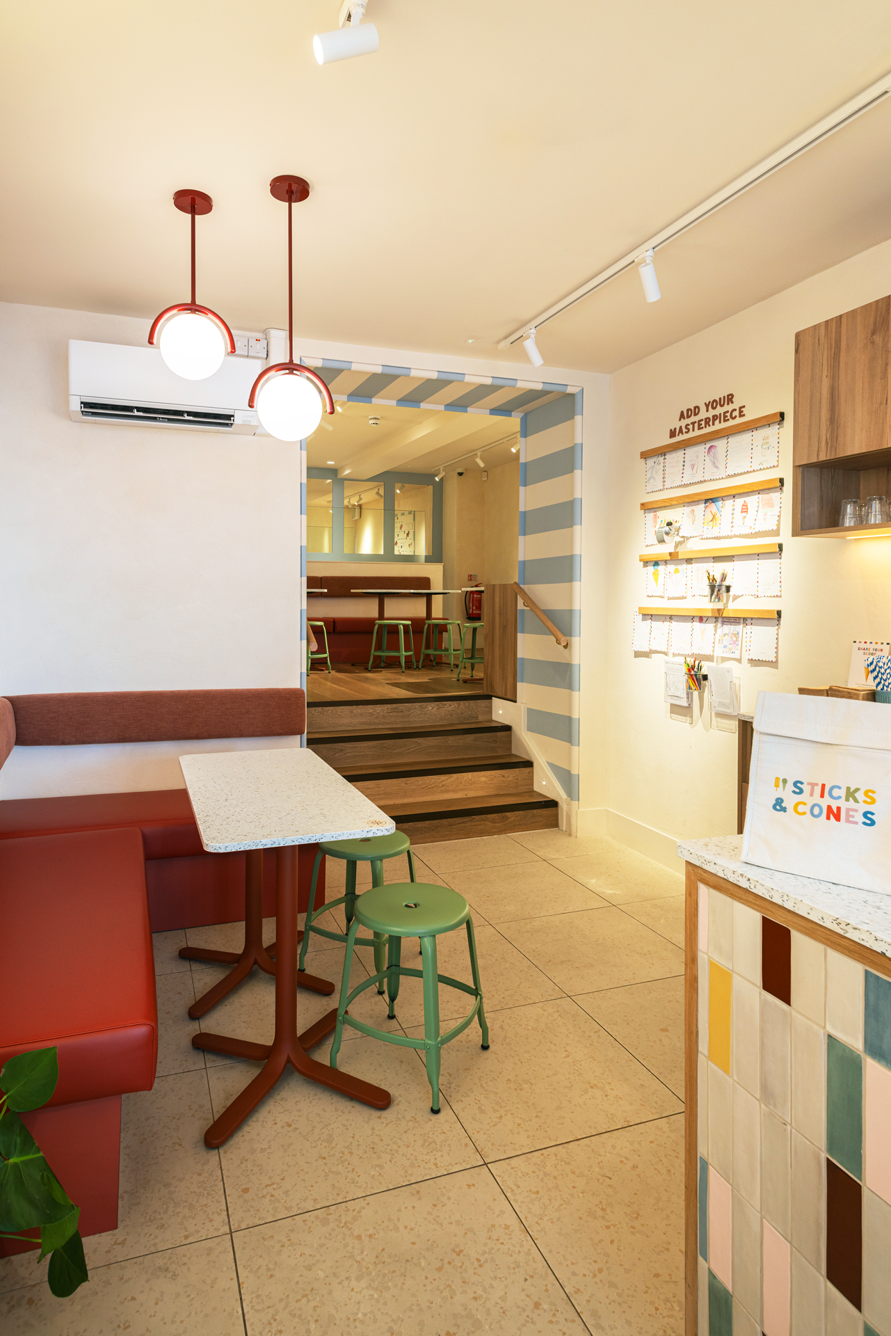
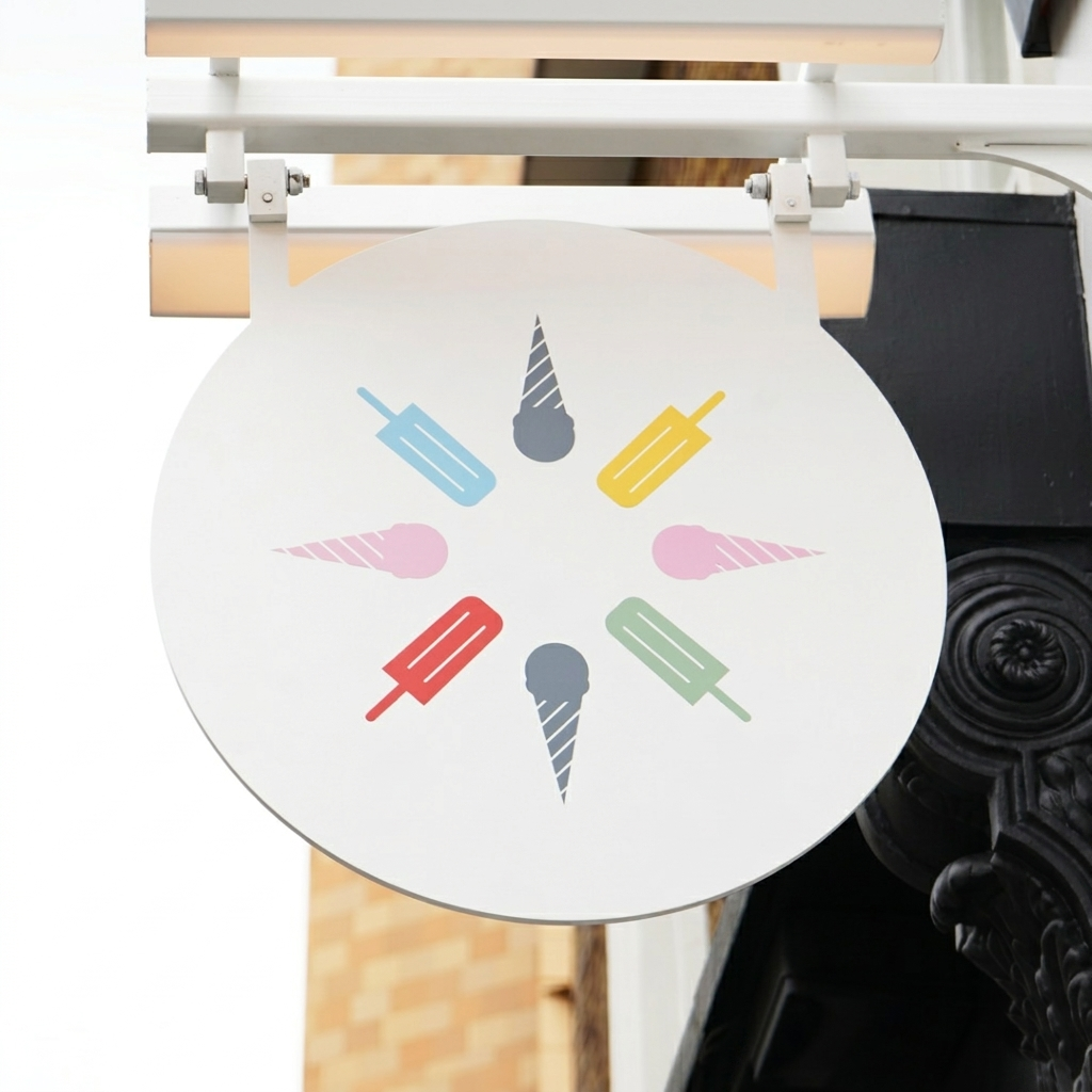
I then designed the brand across the wider experience, including exterior signage, interior wayfinding, wall graphics, packaging, menus, A-boards, flyers, stickers, pop-up and exhibition materials and social content. I also designed and built the fully responsive website.
Nine months after our first strategy session, the doors opened.
The impact
Sticks & Cones opened on Paddington Street in June 2026.
Within weeks it had been covered by The Upcoming, London TV and London On The Inside, with the story of Petra struggling to find somewhere to take her children becoming a central part of how the business was introduced.
Six weeks after opening, Sticks & Cones collaborated with Harry Styles around his Wembley shows, creating a limited-edition Watermelon Sugar flavour.
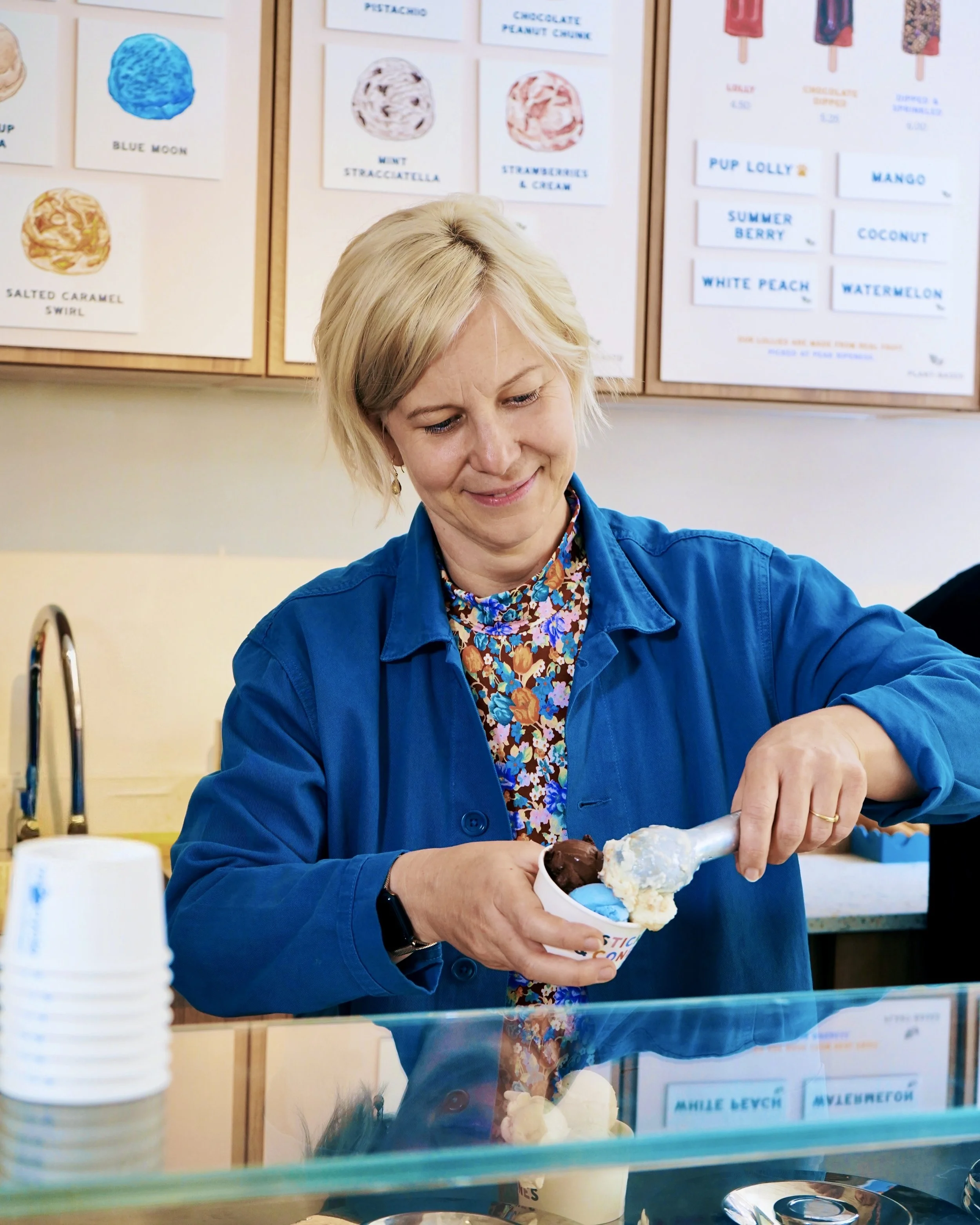
The sourcing reflected Petra’s original ambition too, with milk and cream delivered daily from The Estate Dairy, chocolate from Original Beans, fruit from Natoora and coffee from Climpson & Sons.
And the space itself delivered on the original positioning: seating for twenty at the back, an oversized magnetic wall, a place for children to pin up their pictures, and enough consideration in the design that adults actually want to spend time there too.
What started with Petra being unable to find the kind of ice cream shop she wanted to take her children to has become exactly that place.
Tell me about your project
If you're opening something and you're starting from an idea rather than a brand, that's the part I most enjoy. Tell me where you are and I'll come back to you within a working day.